Projects
Contact
I’m currently open for work and would love to hear from you! Feel free to send me an email: ddang.designs@gmail.com
(c) 2020 Denise Dang
I’m currently open for work and would love to hear from you! Feel free to send me an email: ddang.designs@gmail.com
(c) 2020 Denise Dang
I’m an avid podcast listener and I love that I’m able to gain insights and learn about how stuff works! However after a while I found myself using jumping apps because I would lose track of my last listens in the Apple Podcast so I decided to take on the challenge of redesigning the app!
Having a process in this redesign exercise was important because it allowed me to organise my thoughts and it formed the foundation of my redesign solution. I took the following steps:
Discover insights
Define focus area
Develop potential solutions
Deliver solutions

“The apple podcast app was great about 4+ years ago. It was so clear and easy to track the podcasts you have listened to. It was easy to update podcasts, and organize them easily. And now, the Apple podcast app always shows something different, in different orders. And I've just given up on the app.”
I conducted an app audit on Apple Podcast as well its popular competitors Overcast, Castro and Pocket Casts. I also did a deep dive in online forums such as Reddit and interviewed five of my podcast-listening friends to get an understanding of their listening habits and why users were frustrated with the native Apple podcast app.
I learned the following pain points about Apple's native podcast app:
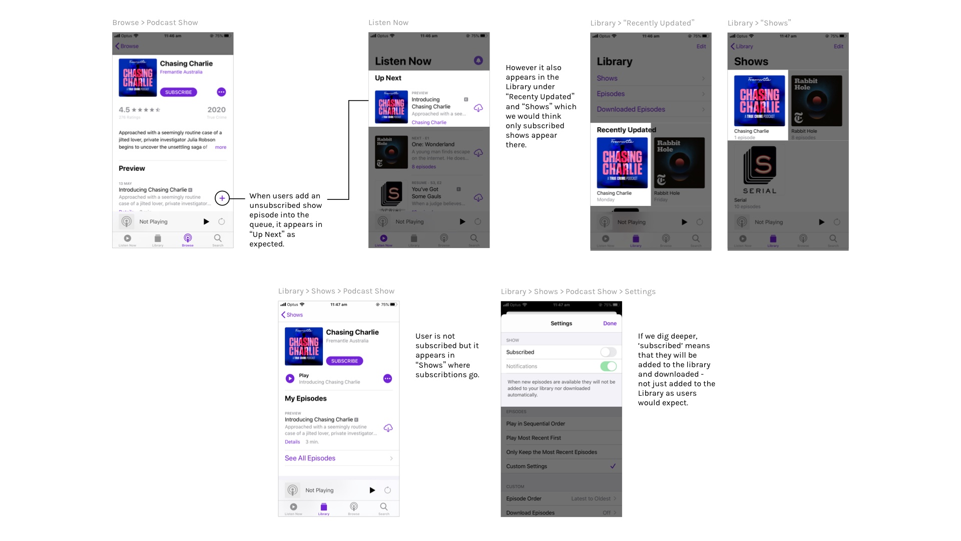
Users had difficulty understanding the queueing system, the different lists and how to remove items that they gave up and switched to competitors
The app lacks customisable features that are offered by competitors such as silence trimming, additional variable playback speeds, reordering queues, volume boosting
Users had trouble finding their last played position
Users noticed that episodes would disappear once listened and didn’t know where to find them
Had difficulty playing the next episode in the sequence because they had trouble finding it or that the app was not auto-playing as expected by users
The majority of users’ frustration were because they found the app’s navigation just simply confusing and resolved this issue by switching to another podcast app where it was much easier for them to find what they needed. Knowing that having limited features was not the main issue, I decided to focus on creating an understandable navigation system.
As I was conduction an app audit, I too felt frustrated figuring out the flows behind certain actions. I reversed engineered my thought process and first considered what Apple’s intentions were behind the design and worked from there, rather than noticing a problem, scraping the existing design and starting anew.
This creates confusion when users see three things playing at once.

“Shows” and “Recently Updated” should be a place where users go for their subscribed content however unsubscribed shows appear in both places if users add an episode from an unsubscribed show to the playing queue “Up Next”.
"Episodes" list the latest episodes from subscribed podcasts however the ambiguous title leaves users confused with what to do because it lists the unlistened, subscribed, unsubscribed, queued episodes from all "Shows". It almost acts like a 'to do' list for catching up on podcasts but it doesn’t allow for a natural listening experience as it lists all shows from when they were released.

“Recently Played” is the ‘history’ of all listened podcasts. However it excludes some episodes that users have listened. For example, episodes that have been queued or part of "Shows" will appear here, however if a user listens to an episode that they have browsed that is not from a show in their Library, then it won’t appear on “Recently Played”.

After listening to an episode, the episode removes itself from "My Episodes", leaving users confused about what has happened to the episode. Though it removes the clutter of listened episodes, users don’t know where to go to find them.

I took pen to paper and explored different solutions taking inspiration from other podcast competitors as well as streaming and listening apps such as Youtube, Netflix and Spotify.


The current Apple Podcast app has four items in the navigation footer. I decided to reduce the clutter, cut down to three menu items and move the search functionality to the Library and Browse pages.

Removed "Recently Updated" and replaced it with "Shows" for quicker access to shows.
Added a button for users to easily create playlists rather than going through 'Edit' on the top right corner.
Re-worded "Episodes" to "New Releases" to give a clearer understanding.
Moved what was "Recently Played" on the Listen Now page and renamed it to "History" for a clearer understanding.

When users play an episode (regardless of whether they are subscribed), it will show up under "Now Playing" and the following episodes will automatically play next in sequential order (listed under "Next Up from...").
In the event users queue an episode, "Next in Queue" replaces "Next Up from...".
The "Recently Played" information is moved to the Library page and nested inside of "History" to avoid clutter and information overload.

"Subscribe" button is now a toggle where users can subscribe/unsubscribe at the same place rather than going into the podcast's settings.
Following the Law of Proximity, the settings button is moved to next to the podcast title to reinforce its relationship, rather than looking like subscription settings.

Added toggle above the episodes to filter between unplayed and all episodes. This way, users can understand immediately that once they complete an episode, it moves to "All Episodes".
Users can easily move episodes between the "Unplayed" and "All Episodes" by swiping left and are given context to where the episode goes.

Volume slider was removed because I learned from users that they changed volume with the phone's manual buttons rather through the app.
Clearer podcast name and episode information.
Users can swipe left/right to change to previous/next episodes in the same podcast show.

I've learned that it's always important to not assume that I know the user even if I may be one. It was insightful interviewing my friends and understanding their experience with products and I would not have learned that had I not assumed that my experience with the app was the same as everyone else's.
I've also learned that UX writing is very important in order to convey clear messages. It's important to not leave users in the dark as it will deter them from continuing to use the product.